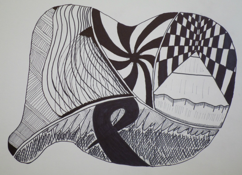


Line Dynamics
I chose this shape by going back through my previous sketches and modifying its shape. I split the shape indifferently, deciding between an inorganic 'x' or a more organic 'x'. I started off doing random organic shapes then eventually came up with my shape. Each quadrant was an inspiration from a video game I recently played. The game itself was a brain teaser with several puzzles that seemed endless and impossible to get through. Things spiraled out of control like the top middle shape. The hallways were long and endless or you fell off like the picture in the top right. The bottom picture is kind of my version of the sound waves of a new song I was listening to with the big mark in the middle resembling the repeat sign. The left picture was what I started with and decided to make thing more complex as I finished the whole project. The purpose of this project was to show lines that went back in space.
I chose this shape by going back through my previous sketches and modifying its shape. I split the shape indifferently, deciding between an inorganic 'x' or a more organic 'x'. I started off doing random organic shapes then eventually came up with my shape. Each quadrant was an inspiration from a video game I recently played. The game itself was a brain teaser with several puzzles that seemed endless and impossible to get through. Things spiraled out of control like the top middle shape. The hallways were long and endless or you fell off like the picture in the top right. The bottom picture is kind of my version of the sound waves of a new song I was listening to with the big mark in the middle resembling the repeat sign. The left picture was what I started with and decided to make thing more complex as I finished the whole project. The purpose of this project was to show lines that went back in space.
Shape Transformation
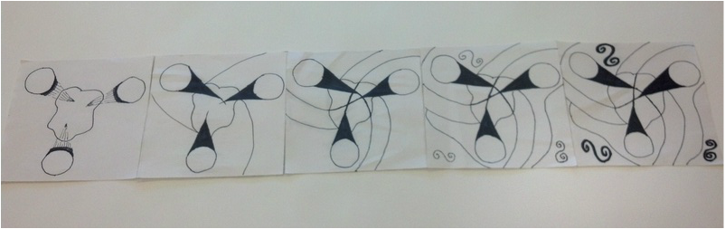
I started off just thinking of circles and an organic shape. then I started thinking ice cream and I pushed it back into space with the cone shapes. I created the outer lines by making the cones turn into curvilinear lines and following the organic shape in the middle. the swirls were added to take up some of the negative space. I attempted to go from organic to inorganic while kind of pushing it back into space a little. The purpose of this project was to show shape transformation.
I started off just thinking of circles and an organic shape. then I started thinking ice cream and I pushed it back into space with the cone shapes. I created the outer lines by making the cones turn into curvilinear lines and following the organic shape in the middle. the swirls were added to take up some of the negative space. I attempted to go from organic to inorganic while kind of pushing it back into space a little. The purpose of this project was to show shape transformation.
Balancing Act
With this project, I was only able to use four squares and a circle. With these shapes, I had to show stability, opposition, dominance, and individuality. We had to come up with 5 different ways to show each category and the sketches that have checks next to them are the ones I decided on. The first one, stability, has the circle wedged between the squares showing that everything is stable. In the second one, opposition, I show that in a line of squares the circle tries to fit in. In the third one, dominance, the huge circle that is barely on the pace dominates the smaller squares inside. In the fourth one, individuality, the squares emerge from the circle as if the circle is far and the squares are getting closer. In the rectangle at the end is a mixture of all of them. the circle is pretty stable at the top, the squares are dominating the circle as far as size, none of the sizes are the same which shows individuality, and the circle is the only shape not overlapping another which shows opposition.
With this project, I was only able to use four squares and a circle. With these shapes, I had to show stability, opposition, dominance, and individuality. We had to come up with 5 different ways to show each category and the sketches that have checks next to them are the ones I decided on. The first one, stability, has the circle wedged between the squares showing that everything is stable. In the second one, opposition, I show that in a line of squares the circle tries to fit in. In the third one, dominance, the huge circle that is barely on the pace dominates the smaller squares inside. In the fourth one, individuality, the squares emerge from the circle as if the circle is far and the squares are getting closer. In the rectangle at the end is a mixture of all of them. the circle is pretty stable at the top, the squares are dominating the circle as far as size, none of the sizes are the same which shows individuality, and the circle is the only shape not overlapping another which shows opposition.
Nature/ Shape
We were supposed to find a 2-D object in nature, photo copy it, create two abstractions one more refined than the other, and then reconstruct one of the abstractions. I started with a few different leaves and planned it out in my sketchbook. I didn't like the other two so I stuck with the third one. My roommate and the rest of my classmates all agree that the leaf looks like it is dancing. I decided I wanted my first abstraction to resemble the leaf with out looking too similar. Since the second abstraction had to be more refined I decided to use geometric shapes and make them go back in space to make it more abstract. The final reconstructed piece has two references: a sailboat and battleship.
We were supposed to find a 2-D object in nature, photo copy it, create two abstractions one more refined than the other, and then reconstruct one of the abstractions. I started with a few different leaves and planned it out in my sketchbook. I didn't like the other two so I stuck with the third one. My roommate and the rest of my classmates all agree that the leaf looks like it is dancing. I decided I wanted my first abstraction to resemble the leaf with out looking too similar. Since the second abstraction had to be more refined I decided to use geometric shapes and make them go back in space to make it more abstract. The final reconstructed piece has two references: a sailboat and battleship.
Silk Screen Texture Books
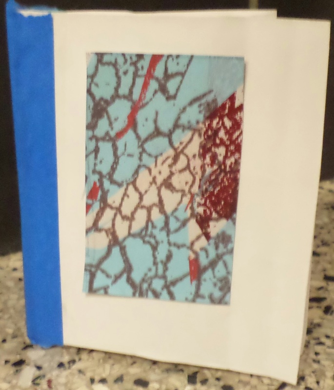
This was a hands on experimental learning project. We learned to print and used the tools that print makers use to create their art. We created screens by using paper with textures on them and shapes we cut out from black paper to make a collage and created a total of four screens to print from. After printing what we thought could create an interesting piece, we cut out the parts that would look good in a book and hand made each one. I created my book by first sewing the ends together (two at a time), then taping it down.
This was a hands on experimental learning project. We learned to print and used the tools that print makers use to create their art. We created screens by using paper with textures on them and shapes we cut out from black paper to make a collage and created a total of four screens to print from. After printing what we thought could create an interesting piece, we cut out the parts that would look good in a book and hand made each one. I created my book by first sewing the ends together (two at a time), then taping it down.


Pattern Saturation
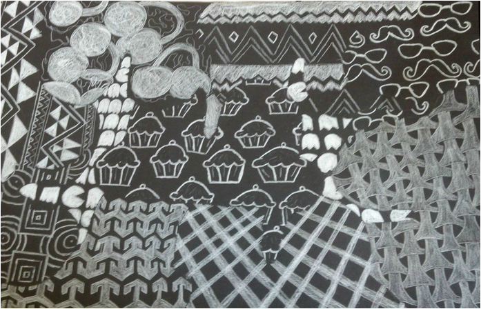
The purpose was to take different patterns and give them a sense of overlapping and directional force. It is also supposed to play with the eye, as according to Gestalt's Theory that we perceive things that remind us of something. The patterns that I chose were just things that seemed interesting to me. The goal was to also combine values between all of the patterns and make them work. My #5 value is the Pacman in the back ground which is giving the illusion that it is under all of the other patterns.My #1 value would probably be the overlapping squares and circles. Each pattern had a specific area that could not show bounding lines. We used a template of our choice to create these spaces. My template was a pair of glasses in which they overlapped several times. The photos below the finished project are the different template ideas that i came up with. I ended up choosing the glasses because i wear glasses and I thought it represented me in a way.
The purpose was to take different patterns and give them a sense of overlapping and directional force. It is also supposed to play with the eye, as according to Gestalt's Theory that we perceive things that remind us of something. The patterns that I chose were just things that seemed interesting to me. The goal was to also combine values between all of the patterns and make them work. My #5 value is the Pacman in the back ground which is giving the illusion that it is under all of the other patterns.My #1 value would probably be the overlapping squares and circles. Each pattern had a specific area that could not show bounding lines. We used a template of our choice to create these spaces. My template was a pair of glasses in which they overlapped several times. The photos below the finished project are the different template ideas that i came up with. I ended up choosing the glasses because i wear glasses and I thought it represented me in a way.
Color Theory
We did several things for color theory. We started with a color wheel made from clippings from magazines. We recreated the color wheel by using the three primary colors of the color wheel: red, yellow, and blue. By combining the colors we were able to create the full color wheel. next we we learned how to create tints, shades, and tones by mixing yellow oacre and white, black, and grey. We also learned that complimentary colors (colors that are opposite of of each other on the color wheel) can be mixed to create neutral colors for example: tan, brown etc. Knowing this fact, we created our skin color using complimentary colors. The last thing we did with gouache was create personal pallets. I called mine Canadian Spring Break because when i went to Canada for spring break it was very cold and rainy. I named my colors Beautiful Day Blue, Rainy Day Grey, Brrrrr... Blue, and Niagara Falls Midnight Grey.
For the last part of color theory, we were all given a specific color and had to research that color. I had the color orange. Orange is a mixture of red and yellow. It represents joy and happiness. It is associated with adventure, enthusiasm, risk-taking, and communication. It stimulates the appetite and conversation. A few symbolic things are prison uniforms, monks"' robes in Hinduism, and the center stoplight in France. Orange is not a great color for dieting, yet restaurants use pastel forms of orange to get people to want to eat and to have a conversation. Orange is probably the most underused, disliked, and ignored color and the only color who got it's name from the object. (No it is not the other way around.) This is just a simplified version on all the things i learned about the color orange.
Three facts about colors:
Red: oldest color; energy, passion, love violence; stands out in advertising
White: new beginnings; complete, perfect clean; means death/mourning in some cultures
Yellow: high energy; happiness, bright, warning/caution; in China official color of Ming Dynasty
Blue: well educated; comfortable, intuition, loyalty; "The Blues" comes from 17th century alcohol withdrawal hallucinations
Pink: perceived by the lack of green; didn't appear until 1920; baby colors were opposite
Grey: "50 Shades of Grey"-always a grey area; unemotional, unattached, neutrality; grey shows knowledge/wisdom
Brown: in coffee shops; protection, calming, friendly; almonds used for aroma therapy
Purple: Purple Haze- Euphoria mainly educed by drugs; higher self, religion, fragile; Amethyst Crystal
Green: life, energy, money, greed; original color; down to earth
Logo, Business Card, Branded Items
The first few photos are how I came across the idea of my logo. My logo is made up of my initials "D.R.T". The 'R' is turned upside down to get people to look at it more. The arrows represent the ups and downs that I go through and I am pretty sure it relates to everyone else. Majority of the arrows are pointing upward because I am a happy person. As for the colors, pink and blue are my favorite colors and I think they look good together. Orange and blue were my high school colors. Orange represents happiness and blue represents sadness, hence the arrows. The blue is in the back to show that it only occurs every so often. Red and green, yellow and violet, yellow-green and red-violet, and blue-green and red orange were other color combinations that kind of interested me since they are all complimentary to each other. The cross hatching at the bottom combined with the drop shadow was to give the effect of the logo being pushed forward . At the end, we had to brand three products, whether it was using stickers, drawing on something, using Post It's, etc. I chose a water bottle which is used every day, a small white container that held first aid stuff in it, and a clear top to a container.
I used several tools in Illustrator to get the logo to look like it does. It may seem simple, but there was quite a bit to it. The rectangle tool was used to create the stem, while the star tool was used to create the triangle to the tip of the arrows. I used the rotate tool to turn the arrows to the direction i wanted them to face. Then I used pathfinder to combine it all together. I used the text tool to add the letters and used the selection tool to position and increase/decrease the size of everything to where i wanted it. The color tool was used to create the different color combinations with the help of the color wheel I made. I used the effects tool to get to the drop shadow. I used he symbols tool to add the cross hatching. Finally i used the layers tool to make sure everything was layered how i wanted it and give the illusion that the cross hatching is behind everything else.
Final Project/ Re-Branded Cube
This project is was to go along with the branding idea, but instead of using our logo, we recreated a already made package. I chose a Kleenex box. In order to do this project, we first took pictures of the different parts of the box (ex. name, clouds, and other shapes and/or words). After we chose our pictures we uploaded them to our computers. Then we began to create the layout of a cube through Photoshop. We created a grey rectangle and then created white squares and positioned them into the shape of a lower case 't'. Next we created the tabs of the cube (the pieces that will be glued together to complete the cube). Once the main setup was complete, we dragged a picture we took of our product into Photoshop and began to cut and paste the pieces we wanted to use. By using the magic wand tool I was able to select specific parts to be cut out. I used this method with the other shapes and words. I also used the transformation tool (Ctrl + t for PCs and Command + t for Macs) to rotate and expand the shapes. The mock copies were printed on printer paper and the final was printed on 11" x 17" Card stock. Finally, I cut out the full shape with the Xacto knife and creased the parts to be folded with a dead pen then folded it into its shape. Then i used cement glue to glue the tabs together.
This project is was to go along with the branding idea, but instead of using our logo, we recreated a already made package. I chose a Kleenex box. In order to do this project, we first took pictures of the different parts of the box (ex. name, clouds, and other shapes and/or words). After we chose our pictures we uploaded them to our computers. Then we began to create the layout of a cube through Photoshop. We created a grey rectangle and then created white squares and positioned them into the shape of a lower case 't'. Next we created the tabs of the cube (the pieces that will be glued together to complete the cube). Once the main setup was complete, we dragged a picture we took of our product into Photoshop and began to cut and paste the pieces we wanted to use. By using the magic wand tool I was able to select specific parts to be cut out. I used this method with the other shapes and words. I also used the transformation tool (Ctrl + t for PCs and Command + t for Macs) to rotate and expand the shapes. The mock copies were printed on printer paper and the final was printed on 11" x 17" Card stock. Finally, I cut out the full shape with the Xacto knife and creased the parts to be folded with a dead pen then folded it into its shape. Then i used cement glue to glue the tabs together.
